


Why Is Black & White Photography So Special?
It's no secret that I'm a huge fan of black and white photography. You only have to look at my portfolio to see that 9 out of 10 shots are black and white!
Mostly Mono Portfolio - MichaelRammell.com
Today I wanted to talk a little about this love affair and why I think black and white can add so much to certain photographs. I also want to give my views on when I think black and white is appropriate and also when it's not. I will of course be giving tips too, such as some of the tools and techniques I use when making a black and white conversion. So there should be something for everyone in here.
That Feeling of Nostalgia
I'll start by talking about black and white and it's timeless qualities. Now, for starters the word 'timeless' is one that is thrown around almost too much in the world of photography. It can be used in a complementary way to describe a photograph, or a photographers style of work, but in truth there are very few photographs (and photographers) whose work is timeless. Just Google the word and you'll see the definition of timeless is given as:
I'd say it's a word too easily used, but Black and White does go hand in hand with timeless.
I remember when I was a very young boy, probably 8 or 9 years old. I have a very vivid memory of a time we were sitting in my Grandad's living room - pretty much the whole family had gathered, uncles, aunties and cousins - we were watching a reel projection of Popeye! I remember the ticking/clicking sound of the reel spinning and the light flickering as the reel of film passed in front of the lamp, projecting this episode of Popeye up onto the wall. I remember my uncle doing his best voiceover (because of course there was no sound) but what I remember most was both the imperfections of the film, and it all being in black and white. It was the black and white visual I remember the most. But as a child the lack of colour didn't bother me, nor did the lack of sound.
Now, I am not suggesting that Popeye in black and white is better than colour and that we should all return to the good old days of reel projectors, but that memory sticks out for me and a great black and white photograph can have the same effect, I think, more than a colour photograph.
I'll perhaps touch on this more when I come to post-processing, but one more thing about black and white is that it doesn't seem to age. Other 'effects' such as Sepia, selective colour, or the more recent fashion of reduced contrast (or bleached effect if you prefer) are quite gimmicky.
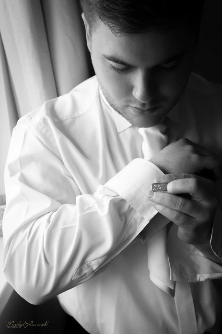
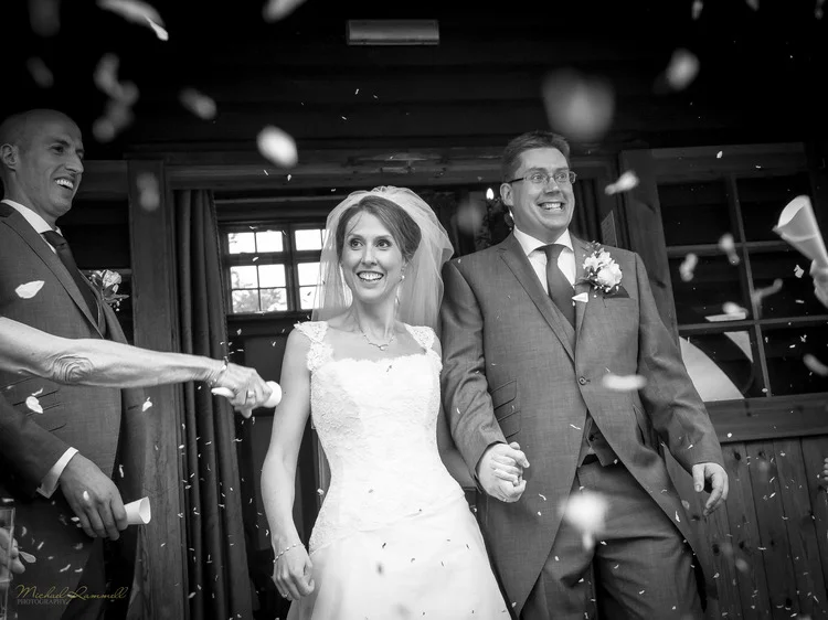
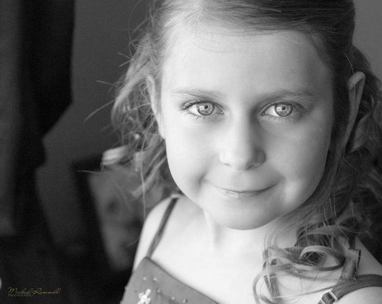
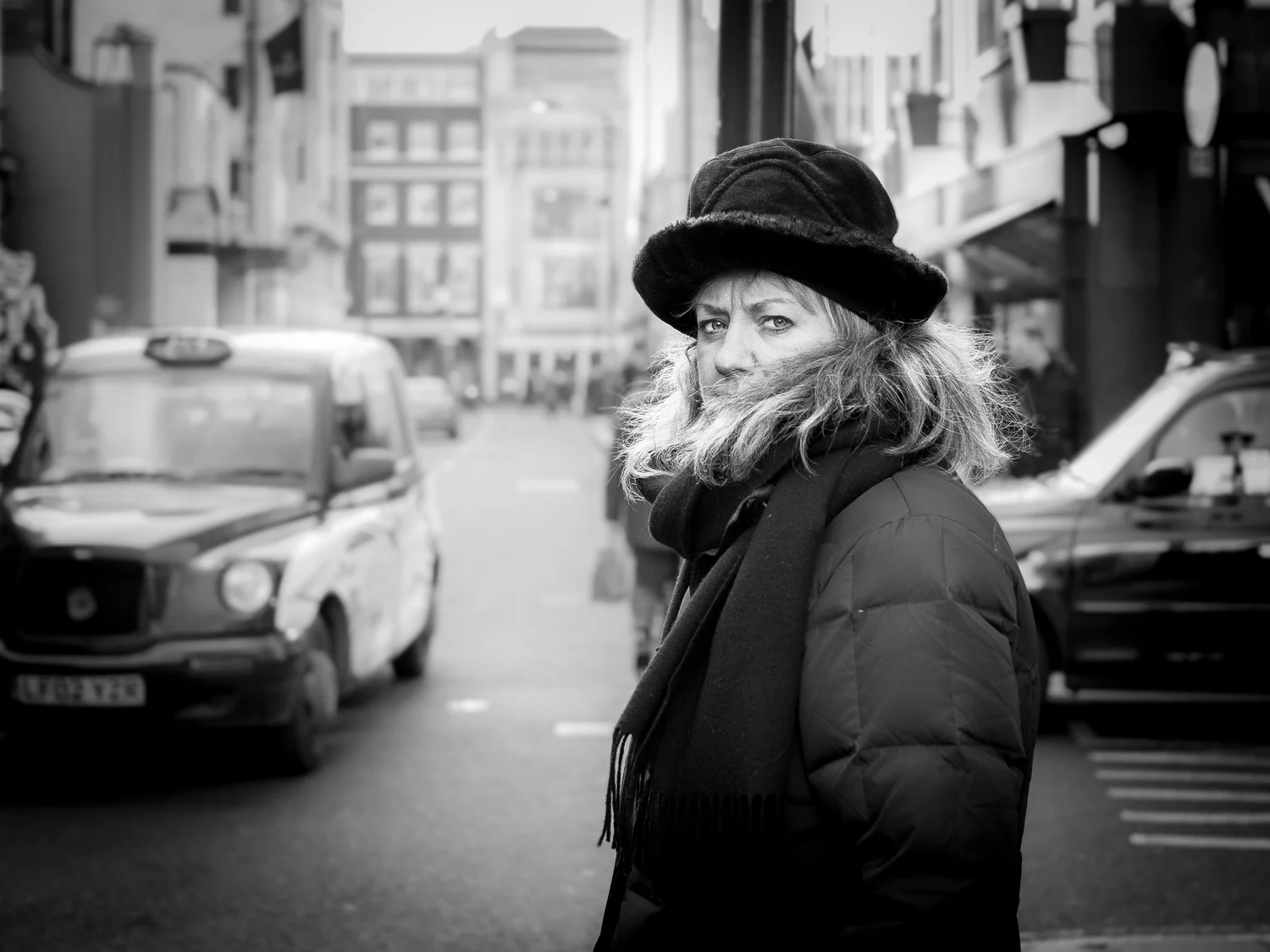
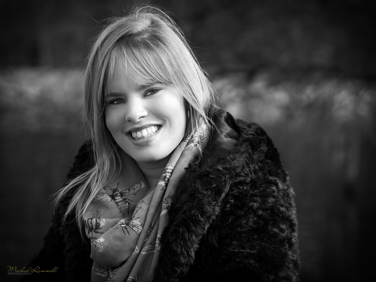
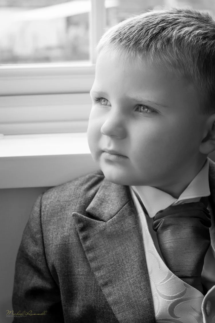
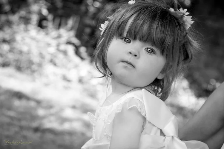
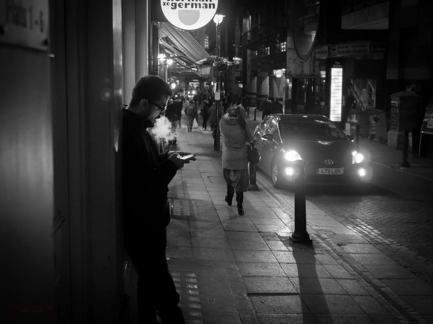
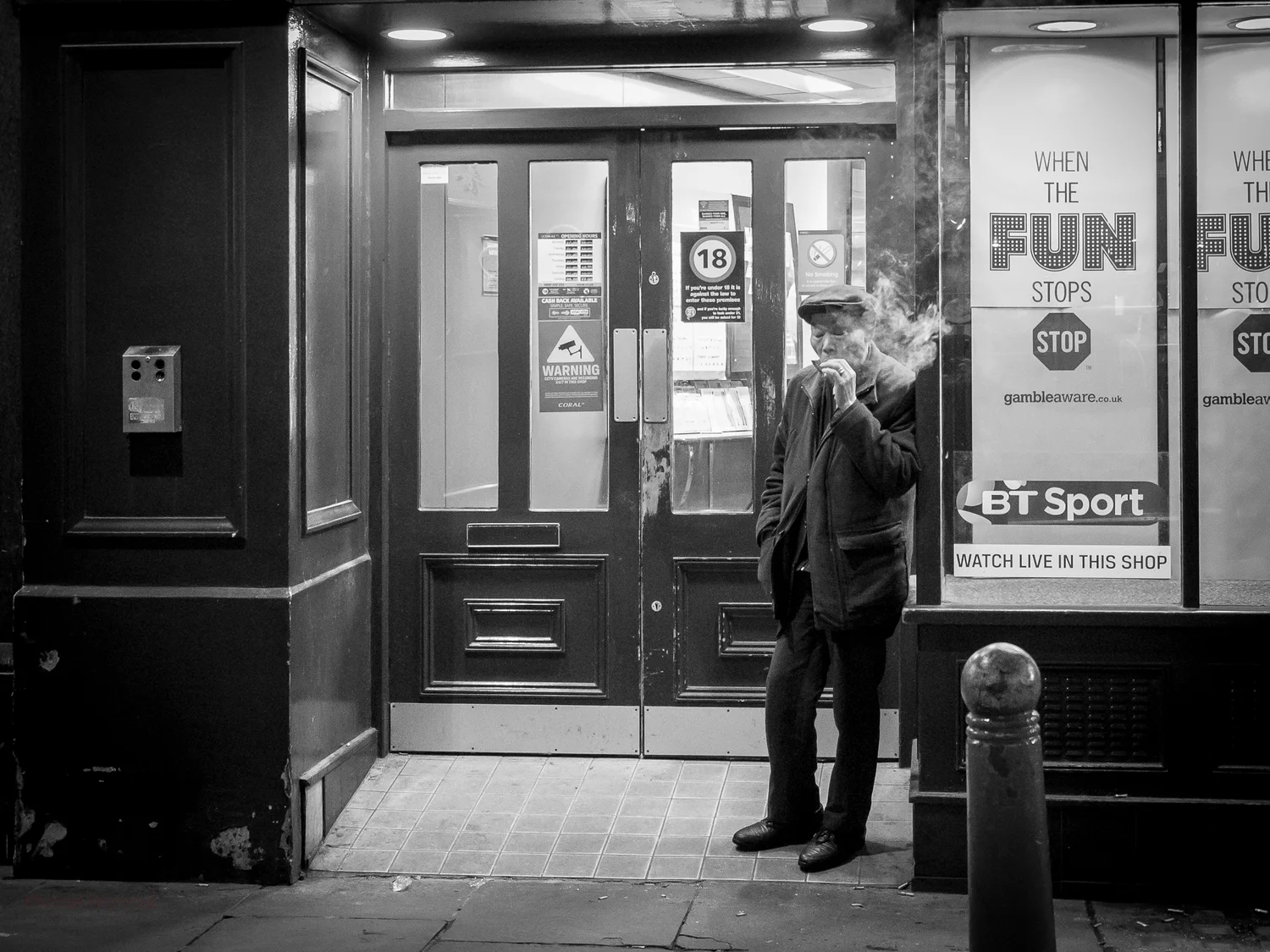
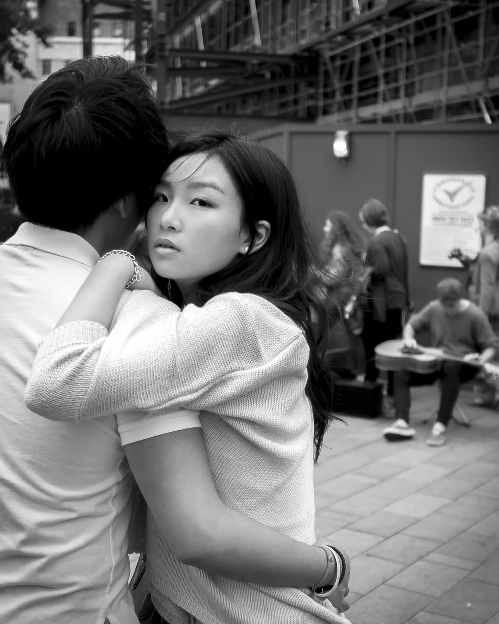
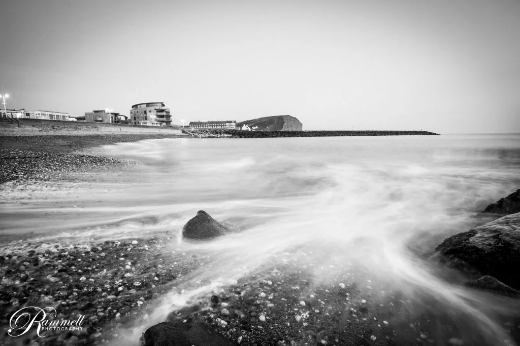
Here are a few of my black and white images from both my personal Street Photography gallery and from my Wedding Photography body of work: [Click to enlarge]
As the definition of the world 'tieless' states "Not affected by changes in fashion": Black and white has been a mainstay in still imagery since photography first came about, whilst these other filters have come and gone, leaving us photographers to look back on them and cringe at our attempts to make them fashionable at the time and then to age. (White vignette anyone?)
Black and white adds to a photograph by taking something away, the other effects all try to add something by adding something...and they just don't quite achieve it in my opinion.
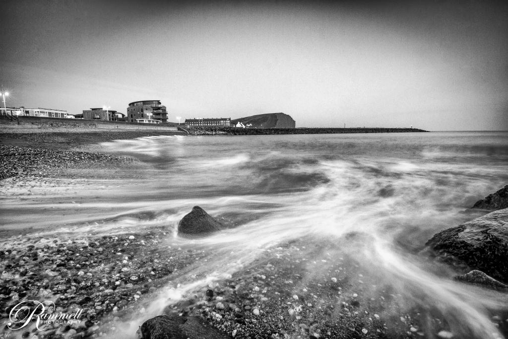
Drama from shadows, light and texture
There can often be a sense of drama to a black and white that just can't be found in a colour image too. However, as an example of a time when colour is perhaps necassary; it would be almost criminal to convert a photograph of an event such as Holi to shades of grey - after all, it is all about the colour and vibrance and that is what offers that event it's impact and sense of fun...the colour!
On the other side of the coin though (the mono side) a black and white image can be farther removed from reality than a colour photograph without looking or, more importantly, feeling, like it's been heavily processed. The minute you start taking someone's skin tone, hair colour or eyes and saturating them, or adding vibrance the viewer knows that isn't real: the red hair becomes the focus instead of the eyes for example. A dominant colour can become the main draw, instead of your intended focal point, such as the eyes perhaps. A black and white can really help here as they hair will become a darker shade of silver or grey, allowing your subject and texture to become the point of focus, instead of a distracting colour.
Conversely, in the way that increasing saturation and vibrance can make certain colours a distraction in a photograph, darkening blacks and lightening whites (increasing contrast) in a mono photograph will more often than not server to create an image that still has the focus on the subject, yet can have a more impactful feel. You can take the tones of the whites, greys, silvers and blacks to near-extremes and not fall down the same hole you would if you were to push colours to their extremes.
Black and white can also highlight or emphasise textures too and this can often be a great thing when looking at skin and eyes: soft, matte skin set against glass-like reflective eyes are far more obvious (usually) in a black and white photograph, because again you are now focussing on the subject and the texture, as opposed to the colour.
Post Processing
This is of course a matter of opinion, but I like my black and white's to be contrasty, clean and rich all at the same time. I say this time and time again when talking about mono photographs, but I like my white's white and my black's black, meaning I will take the white's to the point of clipping and the same with the blacks. Not all areas of the photograph will clip, but for example in Lightroom I'll make sure that the clipping indicator is turned on and I'll pump up the highlights or decrease the shadows until I see a little bit of clipping in certain areas. For me this seems to set the outer limits of the blacks and whites and the midtones (or shades of grey) in between all seem to fall in line so to speak, so we end up with a beautiful, smooth transition from black, to grey, to silver to white (of course, it's more complex than that). This is why for me cameras such as the Olympus OM-D's offer so much when it comes to black and white photography thanks to their great dynamic range, meaning they're able to show us more of the shades of grey that exist and allow them to blend more naturally into one another. The RAW files from these cameras just seem to hold so much data and can really take a pushing and pulling in post processing programs such as Adobe Lightroom.
Tools & Technique
When it comes to me and my black and white work, I have a very set way I like to work on my photographs:
- Blacks have to be black and white's have to be white. I ensure this is the case by using the clipping tool to make sure at least a little bit of black and white clipping is present in my photographs. This is perhaps somewhat contradictory to what a competition judge would advise, but for me this is the best way to ensure a print comes out as the black and white was intended.
- I use the brush to selectively dodge and burn on many of my photographs and I rarely leave a photograph with global changes to the blacks and the whites. I attempt to use light and shadows to enhance the subject of my photograph and separate them from the distracting elements.
- In-Camera, I expose to the right. This is not just a means to reduce noise, but by having details in the shadows and dark areas of a photograph, I can then selectively choose to darken them in post processing.
- Remember: It's easier to add darkness and remove light, than it is to add light and remove darkness (it's more effective to reduce exposure in post processing than it is to increase it)
Black and White Clipping - Setting the Mono Extremes
In this video, even though it is titled 'Preparing a photograph for print' and the photograph in question is finished in colour, I demonstrate how to set the extremes of the shadows and the highlights so that they clip just enough for the photograph to have the 'pop' that it needs to have an impact on the viewer. The video also contains all sorts of other handy tips, such as ensuring a nice bright print and how to thoroughly check your digital files for dust spots during post processing (key if you're about to print the photograph!)
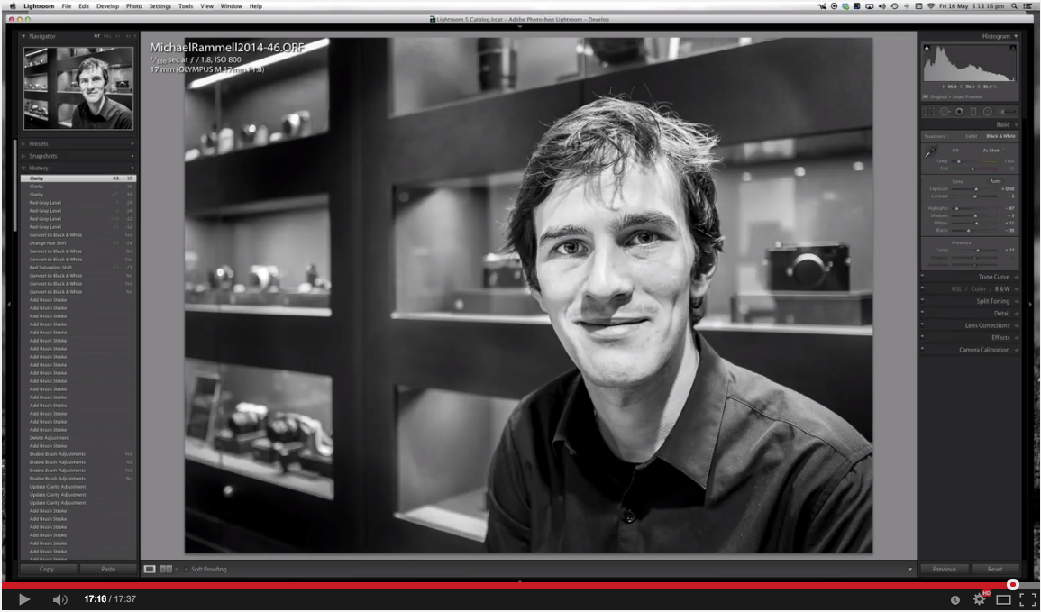
Using the Brush Tools
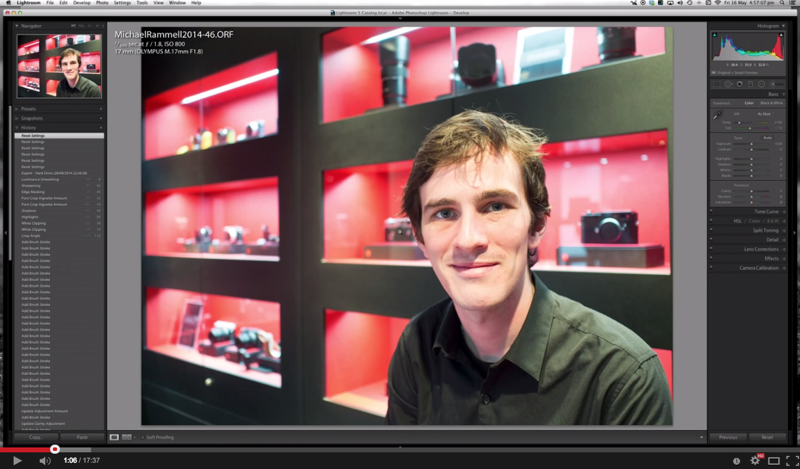
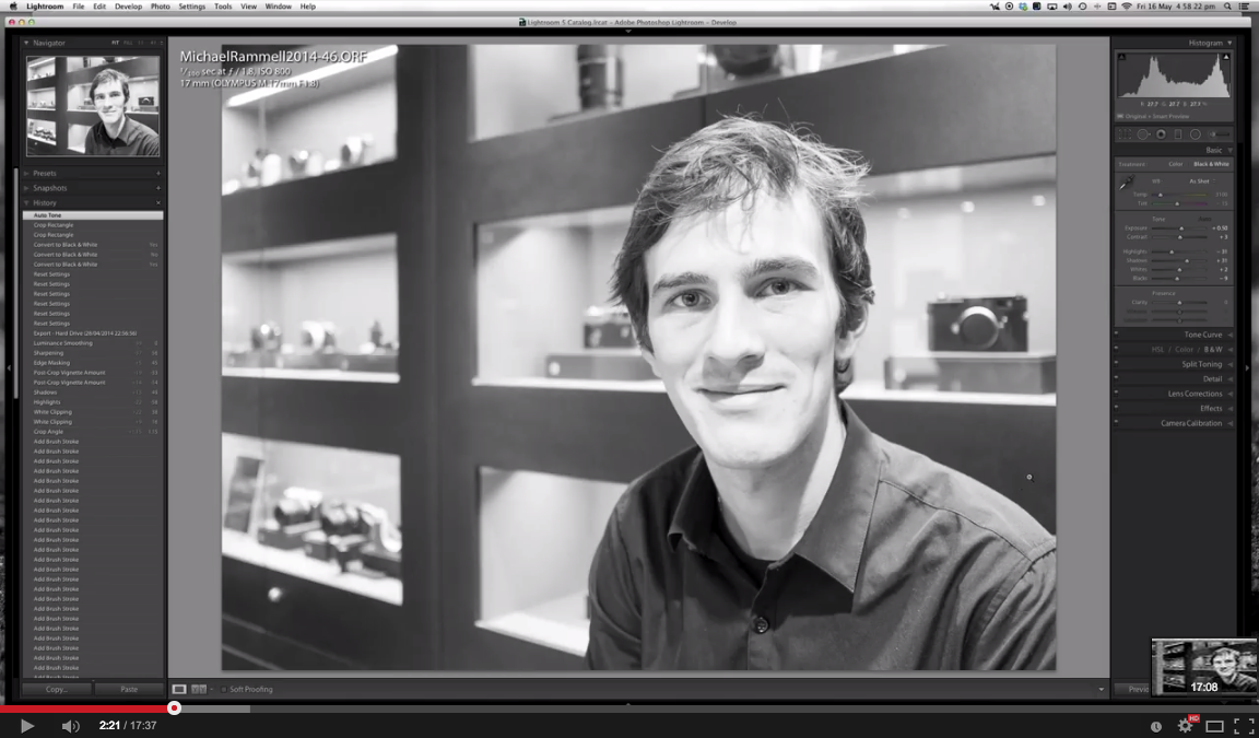
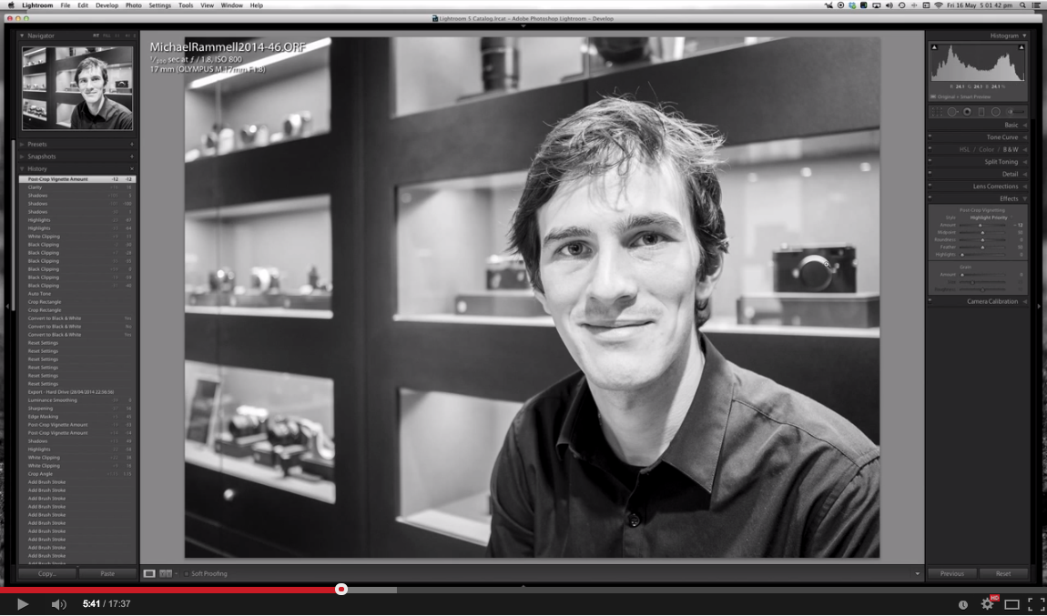
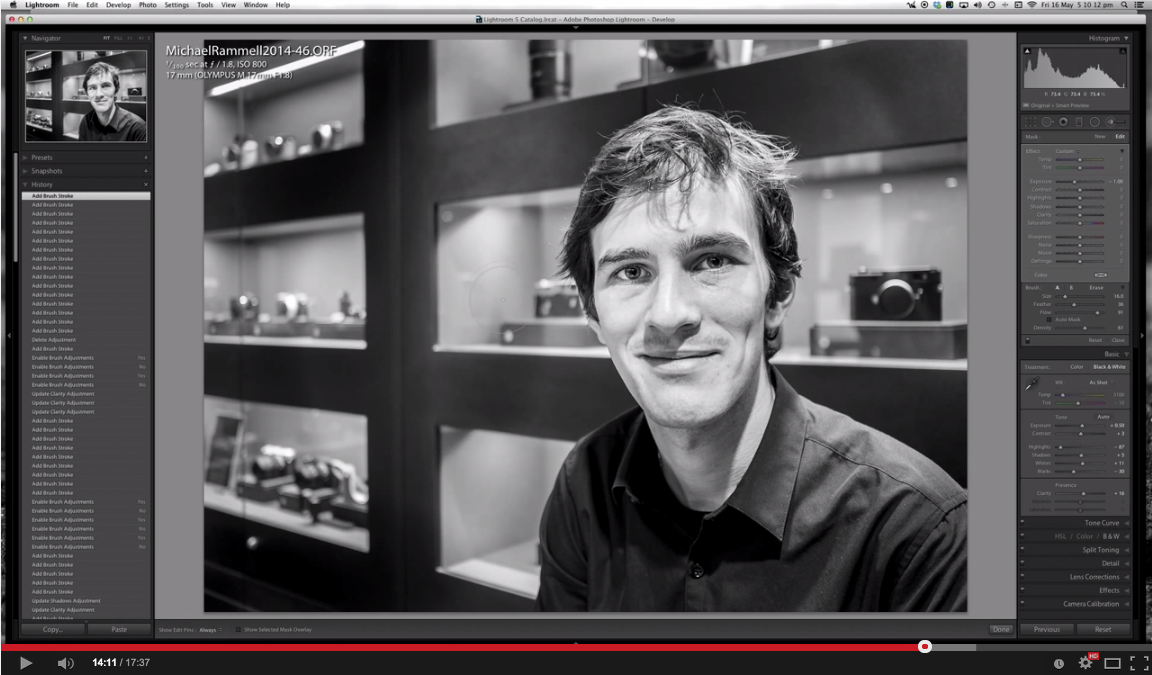
Right here on the blog not too long ago I actually shared this video in which you learn how I take an image, convert it to black and white and then use the brushes in Adobe Lightroom to selectively process my work. You can go from this, to this:

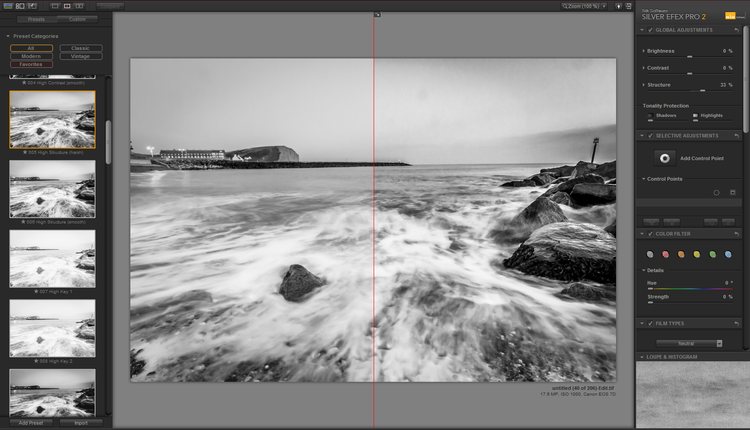
Silver Efex Pro 2
Sometimes, for when you want to just pull 'more' out of a black and white image: Silver Efex Pro 2 should be your go-to software. I find it most effective on subjects that don't include people, such as landscapes and architecture, but in truth, it has the uncanny ability to be able to produce a very pleasing black and white and often reveal textures and shadows you didn't think were present.
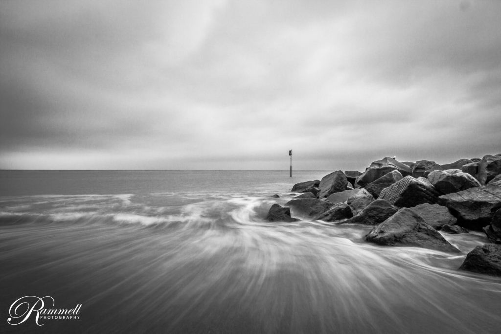
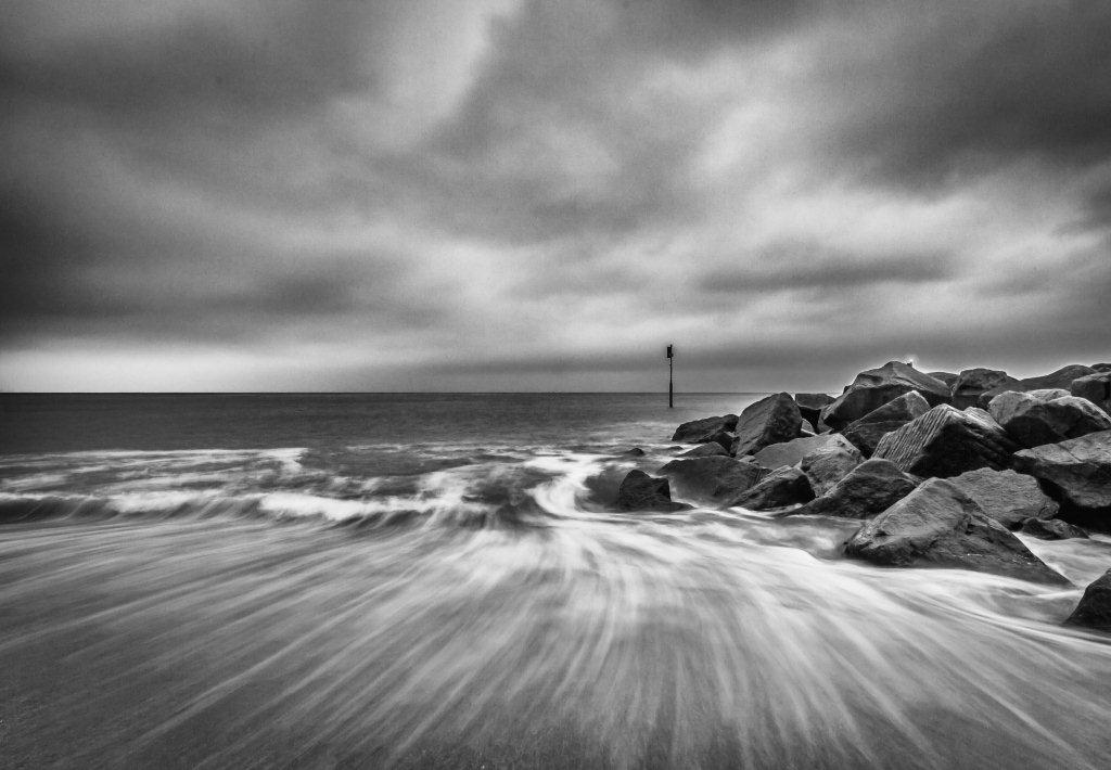
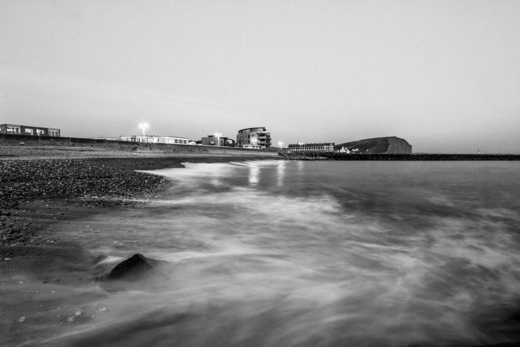
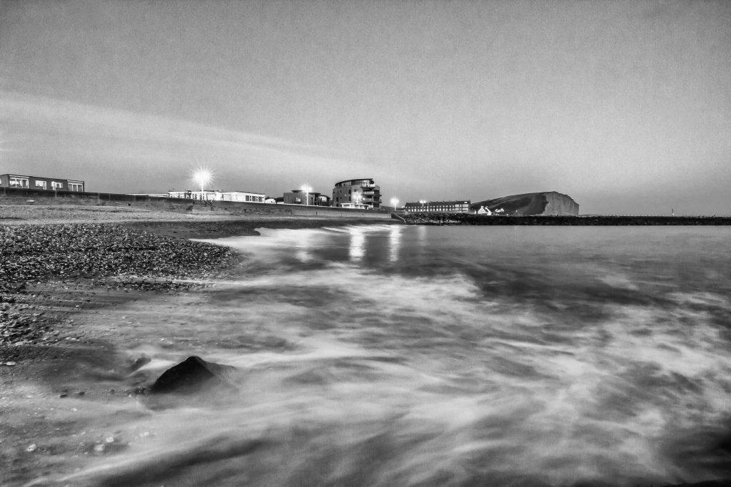
I'm not a fan of plugins, presets and actions etc, but Nik Silver Efex Pro 2 is my single exception to this belief because it is so effective. I haven't prepared a video, but I have spoke about Silver Efex Pro 2 before and it's superb qualities. Here, take a look at these side-by-sides, showing my best attempt at a mono conversion, aside a version of the same photograph that has been ran through Silver Efex:


Inspiring Black and White Photographers
To finish this post I thought it only fair that I share with you some of the photographers I adore that are known for their monochrome photography, or, whose black and white work I simply adore. Take a look and let me know what you think.
Alternatively, are there any mostly-mono photographers you admire that you think the world ought to know about? Share them here in the comments and I'll add their names to this list:
Gregory Heisler
Mark Seliger
Fan Ho
Neil Buchan-Grant
Mary Ellen Mark